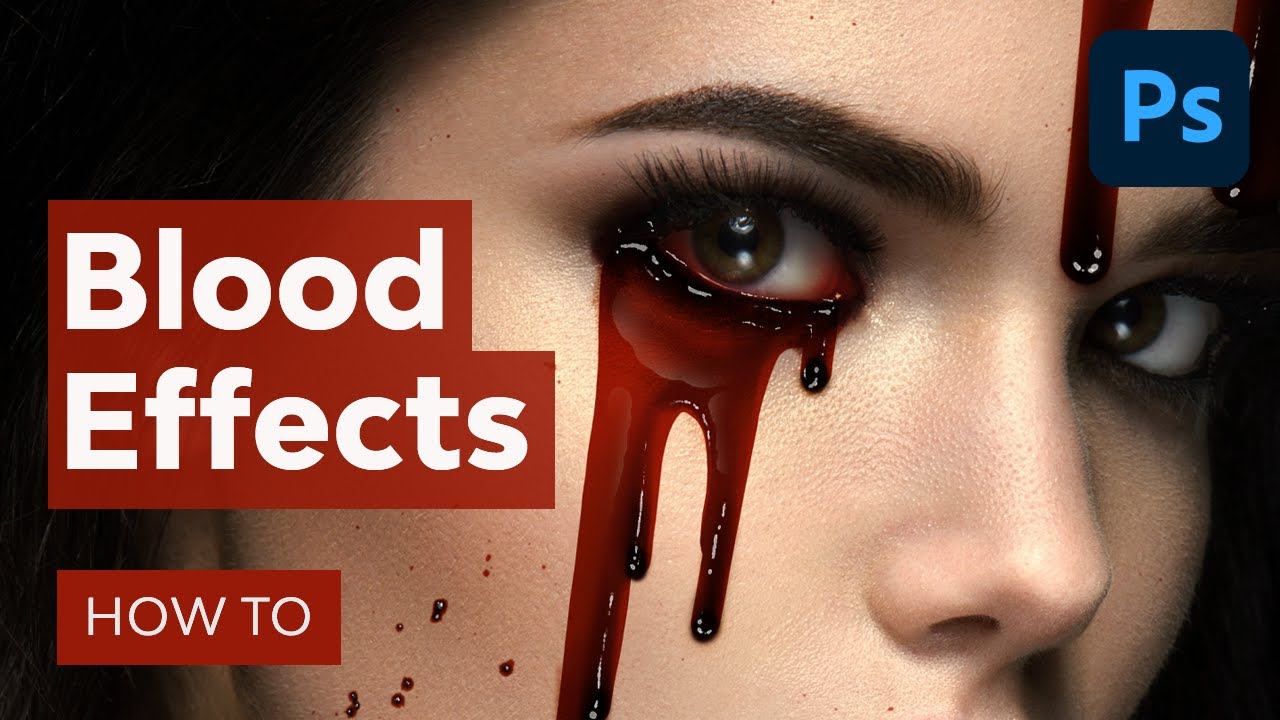
Creating realistic blood effects in Photoshop is a skill every horror enthusiast or digital artist should master. Whether you’re designing for a horror film, creating an eerie graphic, or just exploring your artistic side, understanding how to paint blood realistically can enhance your work dramatically. In this guide, we will walk through the steps necessary to create blood drips and splatters using simple colors and layers, allowing you to add that perfect touch of gore to your designs.
Getting Started with Color Grading
Before we dive into the blood effects, it’s essential to set the right atmosphere for your artwork through color grading. Here’s how to do it:
Create a Brightness/Contrast Adjustment Layer:
- Set brightness to -28 and contrast to 90. This will help in emphasizing textures later.
Organize Your Layers:
- Create a new group named “Color Grade” and place the three adjustment layers within this group:
- Color Lookup Layer: Set to “Foggy Night” with an opacity of 16 and layer mode to Multiply.
- Selective Color Adjustment Layer: Targeting reds, yellows, whites, neutrals, and blacks, set opacity to 28.
- Curves Adjustment Layer: Adjust the top anchor slightly inward with opacity at 75, utilizing the Blend If setting for a seamless transition.
Once these layers are in place and the group is collapsed, you’re ready for the blood effects!
Creating the Blood Color Palette
To achieve a realistic blood effect, you will need to create a color swatch that includes five distinct shades of red:
- Dark Red
- Medium Red
- Light Red
- Bright Red (for highlights)
- White (for bright accents)
Painting the Blood Drips
Let’s break down the process of painting blood drips:
Create a New Layer for the Blood Base:
- Set this layer to Multiply and use the dark red color to paint the initial shape of the blood.
- Utilize a hard round brush for defining the base, focusing on simple shapes.
Layering with Medium Red:
- Create a new layer clipped to the previous one and use a soft round brush filled with medium red. This should cover the blood base, leaving the ends and origins of the drips lighter to suggest flow.
Adding Depth with Bright Red:
- Create yet another new clipped layer (using a low flow rate brush) to start applying highlights, which will enhance the flowing motion of the blood. Focus on areas that would be thicker and more concentrated.
Enhancing Shadows:
- Set a new layer below the blood base to Multiply. Pick a dark shadow tone from your subject to realistically place shadows beneath the drips, enhancing the depth and weight of the blood.
Customizing a Brush for Highlights
Now that the blood base is set, we will create a custom brush for highlights:
Start with the default round brush and adjust the following settings:
- Size: 40 pixels
- Spacing: 16%
- Size Jitter: 50%
- Dual Brush: Set to Default Soft Round Brush, Size: 115%, Spacing: 100%, Scatter: 20, and Count: 2.
- Check “Transfer” and enable pressure controls if using a pen tablet.
- Name your brush “Wet Shine” and save it.
Finalizing the Blood Drips
Now comes the fun part—adding the highlights:
Create a New Layer for Highlights:
- Set opacity to 90% and use white to paint highlights that reflect on the thicker blood. Vary the sizes to give it a more organic feel.
Adding Surface Highlights:
- Create another layer, then paint white blobs over larger surfaces of the blood using the custom drip brush. Use a layer mask to fade out parts of the highlight for a gradient effect.
Enhancing Shadows:
- You may also want to create a new overlay layer to paint varying red shades around the eye areas and under thick blood for enhanced realism.
Creating Blood Splatters
For those who want to take it a step further, here’s how to create blood splatters:
Set Up a New Layer:
- Use a blood splatter brush and set it to Multiply with a vibrant red color. This makes it easier to create bold design elements.
Layer Clipping for Details:
- Paint dots of medium red in the center of each splatter and place white highlights as seen in the previous steps for a juicy effect.
Variating Highlights:
- Be creative with the highlights, emphasizing the shape of the splatter to add richness to your design.
Final Touches
To wrap up, always remember to review your layers and check the coherence of your shadows and highlights. Group your blood layers to reuse them across your project if needed. For more intricate designs or effects, consider experimenting with different brushes and techniques.
Conclusion
Creating blood effects in Photoshop can transform your artwork and bring an element of realism that engages viewers. With just a few colors and an understanding of layering techniques, you can achieve stunning results. Practice these steps to refine your skills, and don’t hesitate to explore advanced techniques as you grow more comfortable.
Keep Learning and Experimenting!
Explore more from Envato Tuts+ to expand your skills in Photoshop and other creative software. Consider giving us a like and subscribe for regular updates and tutorials that refine your digital art expertise! Happy designing!

